
Cracker Barrel’s Identity Crisis: A Marketer’s Take on Why the Logo Debate Hits a Nerve

When a company changes its logo, it usually doesn’t make national news. But Cracker Barrel is different. For decades, it has been a road trip ritual, a place where fried apples and rocking chairs are as much a part of the experience as the food itself. So when they decided to rebrand, shedding their quirky, folksy logo for a sleeker, flattened design, it wasn’t just a cosmetic update. It was a cultural flashpoint.
I’ve been following the backlash, and as a marketing professional, I find myself strangely agreeing with almost everyone. The “don’t change a thing” traditionalists, the designers mocking the new “holding device” shape, the pragmatists pointing out that demographics are shifting, even the cynics who say logos don’t matter compared to food quality, they’re all making fair points.
What I don’t buy, however, is the idea that this rebrand is somehow “woke.” It’s not. It’s something arguably worse for a legacy brand: it’s hollow.
A Quick History of Cracker Barrel
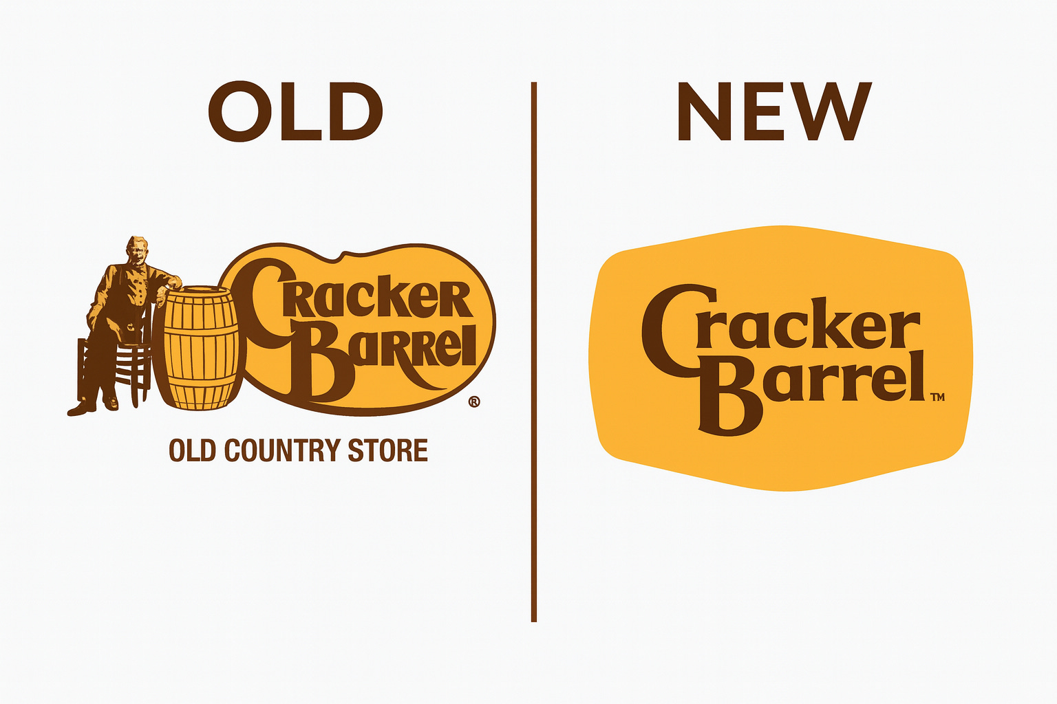
Cracker Barrel was founded in 1969 in Lebanon, Tennessee, by Dan Evins. It wasn’t meant to be just a restaurant. It was built as a roadside general store where travelers could refuel both their cars and their bellies. The company leaned heavily on nostalgia, barrels of candy, checkerboards on tables, a dining room stuffed with Americana kitsch. Its very identity was the “Old Country Store,” and the original logo, with its man sitting beside a barrel, reinforced that.
The name itself was a nod to 19th-century Southern general stores, where barrels of soda crackers sat by the fire and served as gathering spots for conversation. From the start, the brand was inseparable from an imagined “simpler time.” Whether you loved or rolled your eyes at it, you knew exactly what Cracker Barrel was selling: comfort through nostalgia.
The New Logo Problem
Here’s the truth: the old logo wasn’t pretty. Designers could tear it apart all day, the odd proportions, the strange type treatment, the fact that nobody really knew who the man was or why he was leaning on a barrel. But it worked. It was distinctive. It screamed “homey roadside Americana” without needing to be explained.
The new logo? It’s a rounded yellow shield with the words “Cracker Barrel” dropped inside. It could be a fintech startup. It could be a regional grocery chain. It could be anything.
This is what marketers dread: generic design that could fit anywhere but belongs nowhere. Cracker Barrel’s new look isn’t offensive, it’s forgettable. That’s a bigger sin for a legacy brand than being outdated.
Why This Stings More Than It Should
Brands matter most when they tie into memory. McDonald’s could drop the golden arches tomorrow, and people would revolt, not because it’s a perfect logo, but because it carries decades of association. Cracker Barrel is no different.
For many, the old logo was a portal to road trips with grandparents, or late-night pancake stops during family vacations. Stripping that away in favor of a sanitized, corporate-looking badge feels like the company saying, “We’d rather be like everybody else.” That’s not modernization. That’s erasure.
The irony? The old logo was already weird enough to be memorable. The man, the barrel, the extended arm of the “K,” it was quirky, and quirks are the soul of branding. People are loyal to quirks, not perfection.
Demographics vs. Identity
One argument making the rounds is that Cracker Barrel’s customer base is aging out. According to 2023 data, 43% of guests are 55 or older, and only 23% are under 34. In other words, the people who love the old country store vibe are literally dying off. So the company needs to evolve or risk extinction.
That’s true. But evolution doesn’t mean abandoning your DNA. Chili’s has modernized with menu tweaks, remodels, and clever marketing campaigns, all without tossing its recognizable chili-pepper identity. Cracker Barrel could have followed that playbook. Instead, they tried to smooth their edges in hopes of appealing to everyone.
Here’s the paradox: trying to appeal to everyone makes you invisible. Strong brands don’t dilute, they amplify. You don’t ditch your rocking chairs and checkerboards, you double down and reinterpret them in ways that resonate with younger audiences.
Why It’s Not “Woke”
Some critics are framing this as a “woke” move, as if Cracker Barrel erased its logo to appease political correctness. That doesn’t hold water. There’s nothing overtly political about a yellow blob with a serif font dropped inside. This isn’t Aunt Jemima or the Washington Redskins changing under cultural pressure.
If anything, it’s the opposite problem. The new logo says nothing. It’s not a cultural statement, it’s a corporate shrug. Calling it “woke” misses the mark because it assumes intentionality. What’s actually happening is worse for brand integrity: it’s a failure of imagination.
The Real Issue: Misplaced Investment
Cracker Barrel is reportedly putting $700 million into updates, including logo changes, menu overhauls, and remodels. That’s a massive sum. But if you read customer reviews, the loudest complaints aren’t about décor or logos, they’re about declining food quality, long wait times, and value erosion.
This is Marketing 101: listen to your customers. When the average guest says, “The food isn’t as good as it used to be,” no amount of glossy rebranding will fix that perception. Updating fonts is easier than fixing operational execution, but it’s not what brings people back.
A smarter investment would have been doubling down on kitchen quality and guest experience, then using marketing to amplify that story. Instead, they’re rearranging the furniture while the house is on fire.
What Marketers Should Take Away
This whole mess is a case study in how not to rebrand a legacy business. A few lessons stand out:
Don’t confuse modernization with homogenization. You can freshen a logo without gutting its identity.
Respect nostalgia. For heritage brands, quirks are assets, not liabilities.
Solve the real problem. If food quality is slipping, fix that before touching the logo.
Don’t chase everyone. Strong brands repel as much as they attract.
Closing Thoughts
I don’t hate the new Cracker Barrel logo because it’s “woke.” I dislike it because it’s soulless. The old one may have been odd, even ugly, but it was alive. It fit the brand. It carried history.
Rebrands fail not when they’re bold, but when they’re bland. Cracker Barrel had a chance to reinterpret its legacy for a new generation. Instead, it filed down the edges, and in doing so, lost the very thing that made it distinct.
As a marketer, I see a brand in identity crisis, not because culture demanded change, but because leadership mistook looking modern for being relevant. And in today’s crowded market, irrelevance is far deadlier than bad design.